FYI
FYI is an influencer marketplace connecting brands with influencers across the full lifecycle: discovery, contracts, campaigns, creative briefs, analytics, and payments. As the sole designer and de facto PM, I led a complete overhaul of both the brand and influencer portals over two years. The redesign grew the influencer base by 20,000 and drove a 30% increase in platform revenue.
- 20,000 new influencers added
- 30% revenue increase
- Full redesign shipped across both portals
- CEO
- Engineering Lead
- 1 Front-end Developer
- 2 Engineers
Senior UX Designer (Sole Designer, acting PM)
The Problem
Discovery

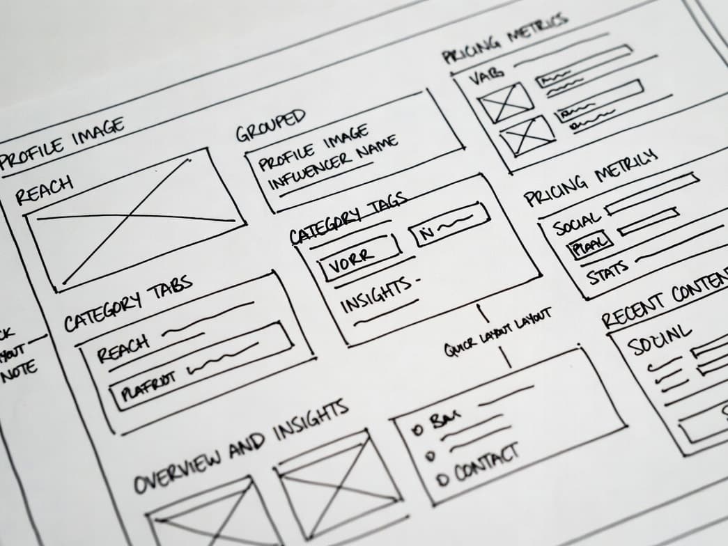
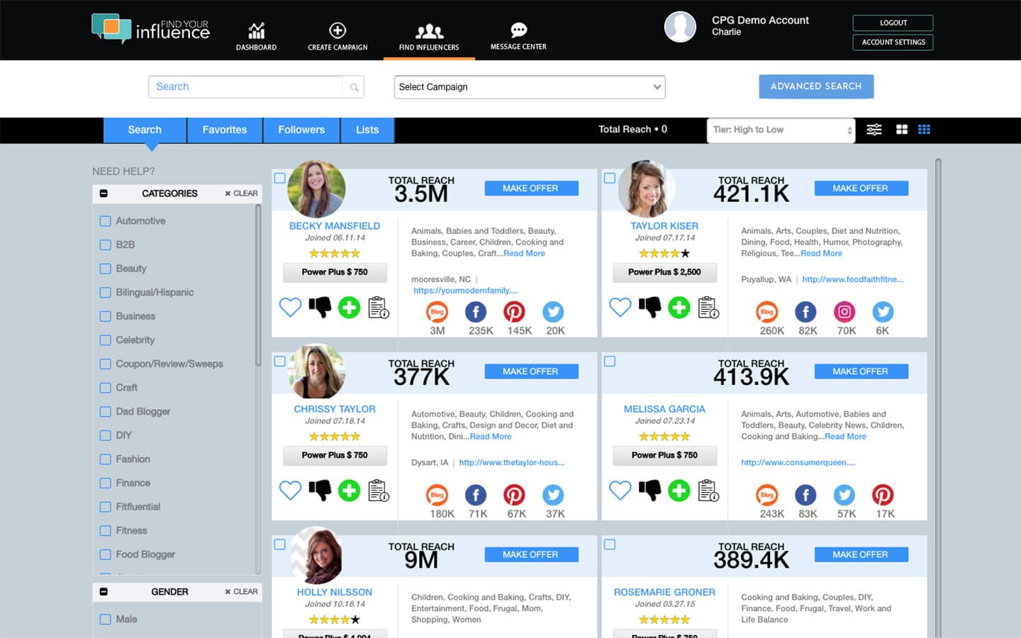
Influencer Search Redesign
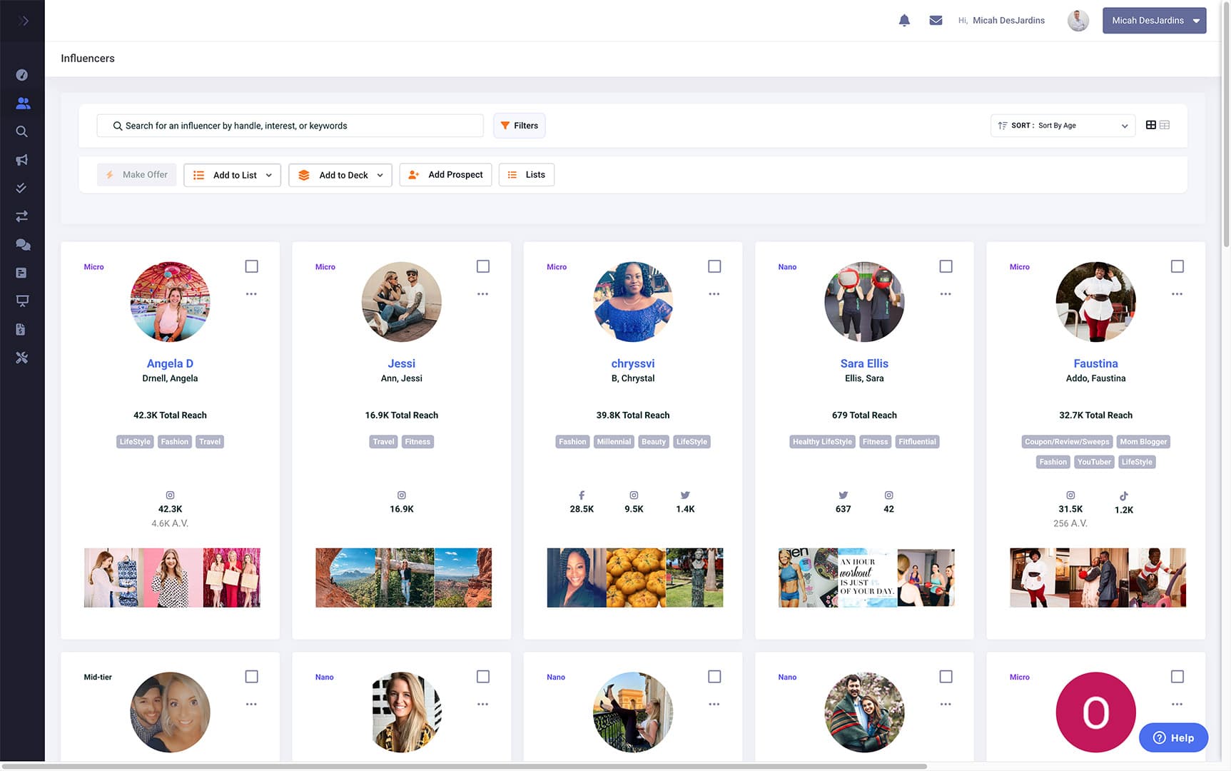
Influencer Portal
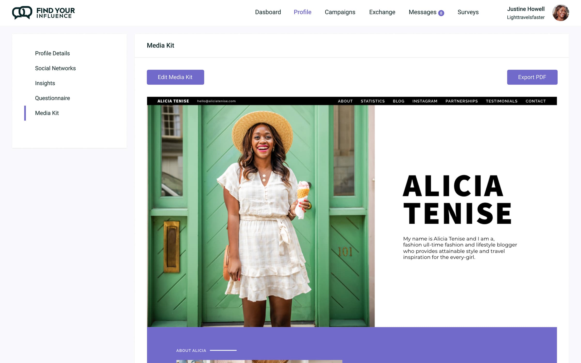
Validation
The redesigned platform shipped across both portals. The influencer base grew by 20,000, driven largely by the self-service portal. Platform revenue increased by 30% as improved search and campaign tools brought in new brand clients. The full lifecycle, from onboarding through analytics and payments, was rebuilt into a cohesive experience that replaced the legacy system entirely.